Design system expansion
As our design system grew, some patterns were becoming restrictive and created friction in the design process. I worked with design leadership to craft an updated design system, which would give designers freedom to be creative without sacrificing consistency.
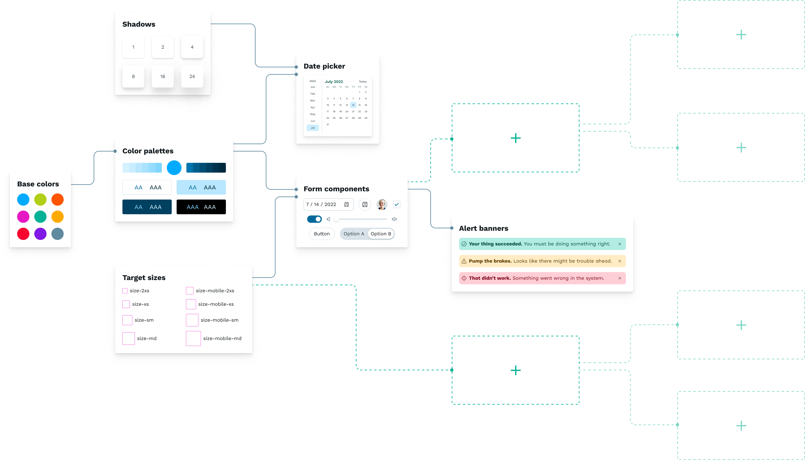
Team explorations
At the start of the project, a global task force of designers was assembled to discuss their experiences with the design system and crowdsource ideas for a visual direction.
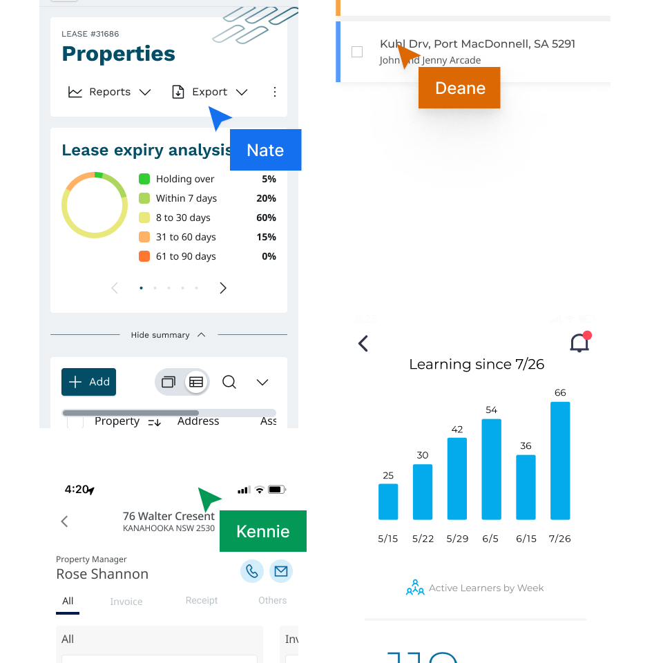
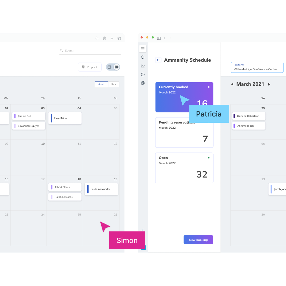
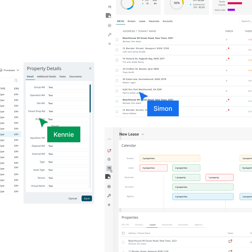
When high-level patterns didn’t fit, designers had a hard time using the basic building blocks of the design system in a cohesive, creative way, so they tended to want to create things from scratch.
Goals
Among other team goals, we identified two key improvements for our design system and Figma resources:
Refresh the look
Our design system had grown out of sync with company branding and UI design trends. Consistency was important but sometimes meant sacrificing a fresh design for a more subdued one.
Make atoms easier to use
When high-level patterns didn’t fit, designers had a hard time using the basic building blocks of the design system in a cohesive, creative way, so they tended to want to create things from scratch.
Design direction
Inspiration was drawn from team conversations, examples from the internet, and the company’s marketing collateral. After weeks of experimentation and critiques, the visual identity and design strategy started to take shape.
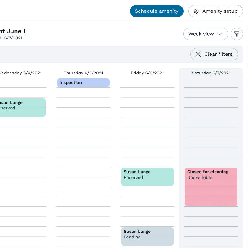
Thoughtful use of color
Saturating the core colors made the palettes more useful at the lightest and darkest ends. UI examples relied on neutral colors to define the structure, and used brighter colors to direct users’ attention, give the UI more personality or color-code information.
Focus on content
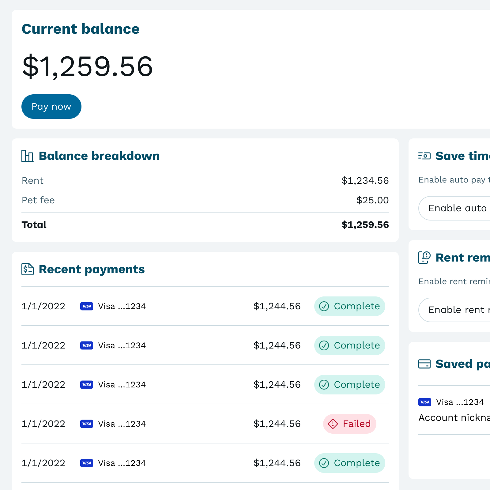
Enterprise UI design can be pretty complex. Cutting down on extra borders and sectioning elements solved some common layout challenges and made dense content easier to comprehend.

Space to breathe
Complex layouts were refactored using patterns like progressive disclosure rather than trying to fit all the UI on the screen at once. This approach also works better for mobile-first design, which some projects struggled with.
Added UI patterns
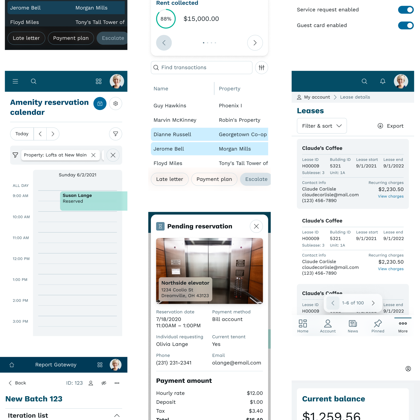
Filling out the library with modern components or patterns for UI gives designers more options and helps interfaces feel more familiar to users.
Testing the system
I conducted research with teammates, giving them an exercise to complete while they thought aloud.
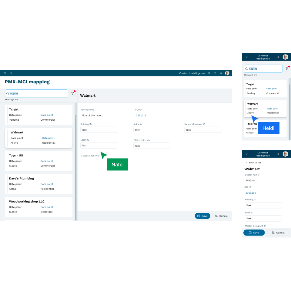
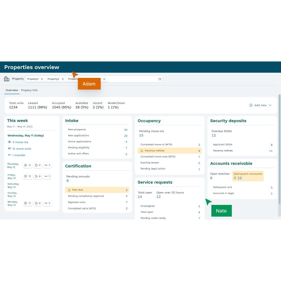
In just a couple of hours, designers improved the clarity and feel of their designs, with minimal coaching. We also uncovered some Figma friction points we could use to further refine and expand the system.